I listen to the Roots
I love music and data science

As I am writing this post, I am listening to Lazy Afternoon by the Roots and I am reminiscence my college years. Those were the days! But on a different note I would like to analyze how The Roots changed in terms of their music regarding one of their first albums (Do You Want More?!!!??! - 1995) to one of their most recent albums (Undun - 2011).
Did Jimmy Fallon change one of my favorite hip artist groups?
They join the Jimmy Fallon’s show in 2009.
Let’s Load the appropriate libraries
library(tidyverse)
## ── Attaching packages ─────────────────────────────────────── tidyverse 1.3.1 ──
## ✓ ggplot2 3.3.5     ✓ purrr   0.3.4
## ✓ tibble  3.1.6     ✓ dplyr   1.0.8
## ✓ tidyr   1.2.0     ✓ stringr 1.4.0
## ✓ readr   2.1.2     ✓ forcats 0.5.1
## ── Conflicts ────────────────────────────────────────── tidyverse_conflicts() ──
## x dplyr::filter() masks stats::filter()
## x dplyr::lag()    masks stats::lag()
library(spotifyr)
library(scales)
##
## Attaching package: 'scales'
## The following object is masked from 'package:purrr':
##
##     discard
## The following object is masked from 'package:readr':
##
##     col_factor
access_token <- get_spotify_access_token()
Step 1: Extract the Data
the_roots_df <- get_artist_audio_features('the roots')
Step 2a: Manipulate the data to get relevant data
mod1_the_roots_df <- the_roots_df %>%
  filter(album_name %in% c('Do You Want More?!!!??!','Undun'))
Step 2b: Manipulate the data to get relevant data
Issues that arise with Spotify is that some artists can upload multiple versions of the same album. So what I did is just find the album id that is most recent for both albums.
mod2_the_roots_df <- the_roots_df %>%
  filter(album_id %in% c('14dfGE6B5TLYdrelQ7AOsa','3N0wHnD5Rd8jnTUvNqOXGz')) %>%
  mutate(m1_valence = 2*valence - 1)
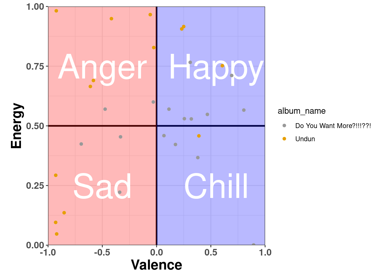
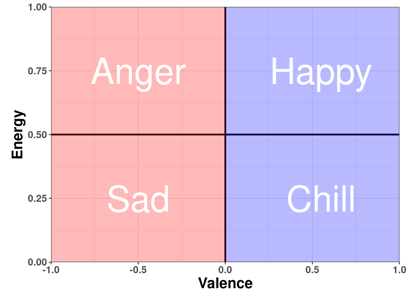
Step 3a: Visualize the the data
We want to see if there is a difference between the albums in terms of:
- Valence vs. energy
df = data.frame(x = c(0,1), y = c(0,1))
p1 = df %>%
  ggplot(aes(x = x, y = y)) +
  geom_blank() +
  geom_vline(xintercept = 0,size = 1) +
  geom_hline(yintercept = 0.5,size = 1) +
  scale_x_continuous(limits = c(-1,1),
                     expand = c(0, 0),
                     labels = label_number(accuracy = 0.1)) +
  scale_y_continuous(limits = c(0,1), expand = c(0, 0))  +
  theme_bw() +
  theme(axis.title = element_text(size = 18, face = 'bold')) +
  geom_rect(aes(xmin=-1, xmax=0, ymin=0, ymax=1),alpha = 0.15, fill = 'red') +
  geom_rect(aes(xmin=0, xmax=1, ymin=0, ymax=1),alpha = 0.15, fill = 'blue') +
  labs(x = 'Valence',y='Energy') +
  theme(axis.text = element_text(size = 12, face = 'bold'),
        plot.margin = margin(0.3, 0.5, 0.1, 0.5, "cm")
  ) +
  annotate("text", x=-0.5, y=0.25, label= "Sad",size = 15.5, color = 'white') +
  annotate("text", x=0.55, y=0.25, label= "Chill",size = 15.5, color = 'white') +
  annotate("text", x=-0.5, y=0.75, label= "Anger",size = 15.5, color = 'white') +
  annotate("text", x=0.55, y=0.75, label= "Happy",size = 15.5, color = 'white')

p1
p1 +
  geom_point(data = mod2_the_roots_df,aes(x = m1_valence, y = energy, color = album_name)) +
    scale_color_manual(values=c('#999999','#E69F00'))